Cart 0

Columbus Park
During the height of the pandemic, we transformed the interiors of this popular restaurant, to create a fresh, new look for its reopening.

CP_Banner.png
 

Columbus Park Trattoria

INTERIOR DESIGN
BRANDING


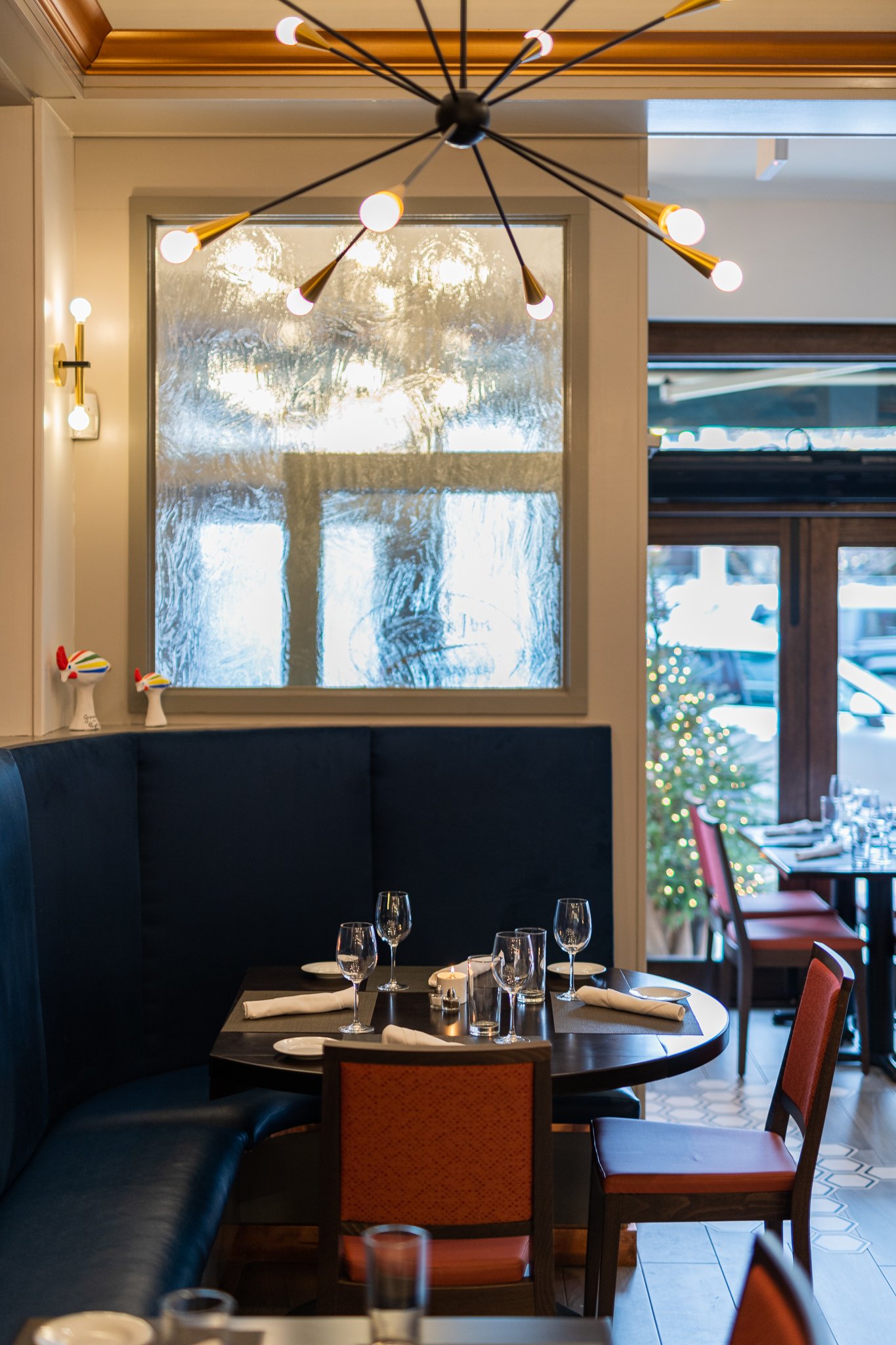
During the height of the Pandemic, this popular restaurant in Connecticut decided to take advantage of the closing and update its outdated interiors.

Honoring Italian tradition and culture, we created the new interior space to reflect the spirit and cuisine of Gravina in the region of Puglia, Italy from where the owners originate.

The interior is light and airy, with architectural touches that are modern and sleek. The bar is crafted of white quartz and walnut. The required wood partition between the bar and the dining area has etched glass that provides separation of the space. The bar back is opened up under an existing staircase creating more space, and the bronze mirror and floating glass shelves give a warm, contemporary look. A Venetian plaster technique is applied to two interior walls that add texture and the exposed brick wall; even more texture and warmth. The ceiling, that was previously dark, is light and bright with copper moldings. Accent colors of mustard yellow on the bar stools, a luxurious blue for the banquet, clay red for the dining room chairs and a soft green on the walls highlight the colors of Gravina.

We researched the cultural crafts of the region and added meaningful touches to the interior. Most notably, a series of hand-painted terracotta ‘Cola Cola’ bird whistles that resemble a magpie and are a symbol of virility and hope.

As a final, personal touch, Karin painted an oil on canvas of the whimsical ‘Cola Cola’ hovering atop the town of Gravina, which hangs on the far wall as a focal point.


Fig & Olive
From concept to completion we expanded a local brand across global locations.


Fig & Olive

NEW YORK | LOS ANGELES | DC | NEWPORT BEACH

BRANDING 
INTERIOR DESIGN CONSULTATION
MARKETING COMMUNICATIONS
MENU DESIGN
RETAIL PACKAGING
WEB DESIGN


Fig & Olive restaurant was looking to strengthen its brand. With three restaurants in New York and new openings on the West coast, Fig & Olive’s exposure had increased three-fold. Its core message — Mediterranean cuisine and artisanal approach —needed to be translated across communications in a way that appeared down-to-earth and not over-marketed. Each restaurant had to stand on its own as well as be part of a larger offer. 

We began by developing a brand strategy and created a brand book that told the Fig & Olive story. Looking into its origins of the South of France, we created elements to further tell the Fig & Olive story — messaging, clean design and enticing photography — all created a warm, inviting look and feel, and resonated with the interior architecture to create an overall consistent experience.


République
Inspired by Place de la République in Paris, we created a brand identity for this trendy, West Hollywood restaurant.


République

BRANDING
INTERIOR DESIGN CONSULTATION
EXTERIOR SIGNAGE


République is an upscale, popular restaurant in West Hollywood, owned by one of Los Angeles’ top chefs, Walter Manzke and his partner and top pastry chef, Margarita Manzke. Located in the historic structure that was built for Charlie Chaplin in 1928, and which later housed the legendary Mark Peel and Nancy Silverton restaurant Campanile, Manzke opened the 10,000 square foot space in 2014; the concept being “French bistronomy meets West coast cuisine”. The free-flowing space offers an all day experience—a patisserie to communal and private dining, to an evening bar menu. 

Manzke was seeking a brand identity to be applied across the entire customer journey. Inspired by Place de la République in Paris, and taking into account the history of the space, we created the brand identity and managed its implementation across menus, clothing, packaging, social media and signage. In addition, we incorporated the colors, textures and materials of the interior space into the brand identity system.


 Blossom + Stem
We used color and light to transform this small, intimate space that blossomed into a full floral experience.


Blossom + Stem

BRANDING
INTERIOR DESIGN
EXTERIOR DESIGN
WEB DESIGN

BACK


Beginning with the design of a brand identity and website, we next designed the interiors of the floral design studio to create a seamless experience. A 700 sq ft empty shell required a workshop, office and retail space for the floral designer and owner of Blossom + Stem. The main priority was for the florist to have a functioning, working studio where she can store and use lots of flowers, supplies, etc. Flowers alone are beautiful, but we wanted to emphasize their beauty with floral patterns and images on the walls. Floral designs were also selected with furniture and lighting. The color palette reflected the brand identity which was brought to life throughout the space. Clean, crisp white was used on the walls and furniture.


Utmost
We created an identity for a nutrition and wellness brand, with a vision to help people lead healthy lifestyles.


Utmost

BRANDING


Utmost is a start-up that is focused on helping people make smarter, more informed choices around their personal health, with an eye toward creating sustainable practices and routines that lead to better overall wellness. A key aspect of Utmost is to educate people and organizations on how smart decisions around personal health also positively impact the health of the planet. The founder was seeking a brand identity that could translate across all communications; mainly for digital and a mobile app.

A brand identity was created that emphasizes connecting, energy and forward thinking. The identity was applied to the design of a mobile app, website, business card and marketing collateral. Brand guidelines were also delivered to describe the color palette, typefaces, gradients, photography style and patterns.


212 Brewing Company
A brand strategy and visual identity was created for this New York start-up that continues to thrive.


212 Brewing Company

BRANDING
MARKETING COMMUNICATIONS
RETAIL PACKAGING
WEB DESIGN


We worked with an entrepreneur who had a vision of a creating a New York craft beer called “212”; he was looking for a full brand identity system for this start-up company. The name (which is the original telephone area code for Manhattan), inspired the brand to be all about New York—its history, architecture and culture. 

We created a brand identity that is a simple, contemporary, bold design. The typeface, Rockwell, is an American slab serif developed in the 1930s that resembles the typeface used by The New York Times.

Bottle labels use images of New York; the designs stand out individually and work together as a family of beers under the 212 name. We also created a website, glassware, tap handle, clothing, business cards, packaging and directed a multi-location photo shoot.

212 Flat Iron Ale is available on tap across various hotels and restaurants in New York City, and in Yankee Stadium.


Café Silvium
We designed the interiors for a popular, local restaurant that transformed the customer experience; doubling business within one year.


Café Silvium

INTERIOR DESIGN
EXTERIOR DESIGN
WEB DESIGN


A popular, local restaurant in Stamford, CT was seeking a renovation and interior design of its space. Its outdated interiors no longer stood the test of time or gave justice to its reputable menu. The owners were seeking a fresh, contemporary and warm look to give the feeling of a comfortable trattoria to attract new customers while retaining current clientele.

Warmer colors, wood flooring and new furnishings were used with the striking contrast of a dark ceiling. The wall between the porch and dining room was opened up to create a continuous flow of the space. To create a wine bar/trattoria feeling, wooden wine crates were used for the front façade of the bar and the crates line one wall with wine bottles. Original photographs and objects from the owners’ native Italian town were organized to be thoughtfully displayed throughout the space to show their history. 

We also designed the restaurant’s website to communicate the experience of the new space. 

The restaurant has an incredible following and doubled its business in one year and has won awards for Fairfield County’s best Italian restaurant.


 FlySpace
We transformed this 2,800 sq ft industrial space in Manhattan to create a multi-purpose experience for fitness and physical therapy.


FlySpace

INTERIOR DESIGN

BACK


FlySpace is owned and operated by a physical therapist and personal trainer. They required a multi-zoned, multi-functional space for different client needs. The 2,800 concrete space has no windows, 16 ft ceilings and required three different materials for flooring. To “zone” the space, we decided to give the personal training area a masculine, rugged look, and the therapy area a softer, warm look; the hallway required a space for dance clients to stretch.

Materials, lighting and acoustics were the priorities for this space:
– A cushioned, soundproof floor was used for the personal training area.
– Wood flooring was used for warmth.
– DanceStep material was used for the hallway floor.
– Acoustic, decorative panels helped to absorb sound.
– Large, LED halo pendants were used for effective light and to create a dramatic look and feel.


Hoxton Gin
A name, brand identity and packaging were developed for this London gin. Today, the gin continues to fly off the shelves.


Hoxton Gin

BRANDING
NAMING
RETAIL PACKAGING


Hoxton Gin was created by Gerry Calabrese, London’s celebrated mixologist and owner of The Hoxton Pony, a popular club in London's East End. Having worked with Calabrese on promotional materials for The Hoxton Pony, we were commissioned to create a brand identity and packaging design for the new gin.

Before starting any design work, we took a step back and questioned the working name, “Gerry’s Gin”. The name wasn’t speaking to the hip, sophisticated target market. To align with the London club and the area, we proposed “Hoxton Gin”. The name was embraced and we then developed the brand identity to also align with the Hoxton Pony’s look and feel. The packaging design used bold graphics and a bright yellow accent color to emphasize the zesty grapefruit and coconut ingredients.

Hoxton Gin has extended to Hoxton Spirits and is sold across the UK and Europe.


Tarantino’s
We designed the interiors for this popular restaurant and bar to attract new customers and stay competitive.


Tarantino’s

INTERIOR DESIGN

BACK


A popular restaurant in Westport, CT was seeking a new design of its interiors to attract commuters from NYC; maintain local clientele and compete with a Mario Batali restaurant opening nearby. The owners had a passion for their Italian American heritage and a nostalgia for the “old country.” To create a contemporary yet nostalgic feeling, we used a retro, 1960s color palette of reds, purples and pale blues. Black & white photos of 1960s Italian and American film stars were hung on the walls; retro style mirrors; low lighting; dark ceilings; and white marble were used to create a dramatic atmosphere and add a nightlife appeal to the dining room and bar.

The restaurant has an incredible following and doubled its business in one year.


A portfolio of logos…